Digital Illustration-GD211

Adobe Illustrator class

Semester 3
Final Grade: A


Content includes:
Final-The Claw Poster

6 Assignments, comprehesive pieces for the class.
1 Practice piece required during class.


Tuesday, September 21, 2010

Final-The Claw Poster


Last week, on the very last instruction day of class our instructor showed us how to create, "Gradient maps." This is a similar style of technology that movies use to create their computer-generated 3D characters.
I've waited my whole life for this.
This provides for me a chance to create 3D style images of my line drawings; how I've always envisioned them. This is what I've been waiting for to successfully communicate my ideas to the world so that they can see them from my vision's point of view.
I've been very grateful to this class and the instructor. It's allowed my creative vision to cross the gap from my imagination to realization.
I'm excited to see what I can do next with these new tools!

Monday, August 23, 2010

Ice Cream Tower-Assignment 6


This is an assignment designed to be a simple illustration based on the term, "Dessert" from the Illustration website "Illustration Friday." As part of the assignment's perks for extra credit I'm going to try and post it as a submission to the website.

Halloween's Curse-Assignment 5


The instructor suggested to make the mom fatter, so I did for this last draft. I do like the comparison between the two, and the difference in 'time' helps to mark the changes in the individuals. I believe this better communicates what I was going for originally.
The instructor did say he liked this one much better, too.

Many of the class participants stated that they would like to see the people as obese. One student recommended having a ton of food behind them to ask the question, "Why are they eating more when they are already obese?"
I liked his idea so much I thought I would try it to see if it conveyed the message better.
It makes me want to combine this image with the Final image and add years to the banner. "Happy Halloween 2008!" and then, "Happy Halloween 2010!" I believe that would convey the message I was originally going for.

Here is the final piece I turned in. The obese shadows in the background are intended to convey the character's future selves if they continue to eat more and more 'traditional' holiday snacks.
Unfortunately, the class also felt that this idea was not conveyed well and that shadows have nothing to do with a foreseeable future.
While I can see their point of view I still think it's a nice piece.

This was an assignment to create a cover for popular "The New Yorker" magazine. The magazine cover typically follows a certain art style and conveys a message.
My wife and I are huge health advocates and while we are both huge fans of Halloween we also realize the unhealthy impact the holidays have on our nation.
While I agreed with my class that the draft piece fails to deliver the message I still feel it's a beautiful piece.
As part of their suggestion I'm going for a different aim for the final piece.

Dolphin-In-class Assignment


I typically haven't posted the in-class assignments but this one is pretty neat for a quick exercise.
We drew our quick exercise in Illustrator, grouped the layers together, and then exported it into Photoshop for texture painting.
What excited me about this exercise is that I love to paint but was often upset when I couldn't hit 'undo'. With this option I'll be able to enjoy the best of both worlds: painting with a digital edge.

Book Covers-Assignment 4


Shatter Shard for the Comic Book Cover assignment


I wanted to show another comic book character, Shatter Shard, seperately here.

The Claw for the Comic Book Cover assignment


I wanted to show my comic book character, The Claw, seperately here.

T-Shirt design-Assignment 3


Design 2

Design 1

Here is my final design for the T-Shirt. It definitely has a lot of elements and detail compared to some other designs in the class. But this is the image I had in mind (minus the map background, of course).
This is intended to be a fan-based accessory. It sports the Realm Warfare logo, catch phrase, and spotlights one of the characters with their army's color (in this case, Sabra of the red army, who is my favorite character from the game).

Realm Warfare-Map


I also wanted to include the game's map as a background to Sabra but the instructor said it made the image look too busy.
So I decided to post it here seperately.

Realm Warfare-Mari's Sabra


For our 3rd assignment we were given the task of creating a T-shirt. Even though I'd been dreaming of creating T shirt based off of my comic characters I decided to encorporate my Realm Warfare theme. Here is a pose of the red army's Sabra with my niece Mari's depiction design.
I started to give it depth and shading but it didn't generate the positive response from the class I wanted so reverted back to the original. They liked the original much better.
I wanted to include it seperately from the complete design.

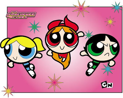
Powerpuff Girls-Assignment 2


This was a good overall example assignment for Illustrator, since it's how the characters were made.

Iceburg-Assignment 1


This assignment was designed to create an image using only simple shapes. We were limited to adding points and manipulating paths but we couldn't create new paths yet. I was able to get away using a gradient, though.

Monday, August 9, 2010

Iceburg Penguin


I couldn't see this image in my mind without penguins. I thought it'd be easy to throw together a few elipicals to make a quick penguin image. However, the online model I found required more than just a few circles and before I knew it, he was his own image. So I thought I'd include him seperately.